
Understanding the solar chromosphere through spectral lines
This article takes the reader through a journey of inferring the cosmos - specifically our dear neighbour Sun - through various properties of light. The journey meanders through our work on understanding solar chromospheric properties through spectral lines, and seems to cluminate in the sea of questions raised by our work!
Light is one of the most fundamental, complex and inherently mind blowing things to exist in this world. Every culture across the globe attributes (or attributed) great significance to light, while adding multiple layers of symbolism and meaning. Light has its influence right from the chloroplasts in plants converting water & nutrients to sugar and Oxygen, to the largest of solar panels to generate electricity for entire cities. Light is, in some sense, our window to this world.
The same is true for astronomers. Imagine an astronomer working - I am pretty sure your immediate thought is a person looking through a telescope in the night sky. Well, you are pretty correct - in that most information about the universe comes to us through light! But light is not just what we see: the radio frequency on which mobile phones operate is light, and so are the X-rays which are used to check for bone fractures.
What kind of light exists depends on how it is generated in the first place. The simplest way to make light is to get objects hot. A hot iron rod glows red, while an arc welding plasma glows blue. Heat, and temperature are primary drivers of what kind of light comes out. This colour of light is given by the wavelength (or the frequency) of light. The larger this frequency of light, smaller the wavelength is, and more the energy in light. X rays have a very short wavelength (and so high energy), while Radio waves have a very long wavelength (and low energy). Similarly, red light has a larger wavelength than blue (or violet) light. So, in general, hotter objects have more energy, and hence emit more in short wavelengths, while cooler objects have lesser energy, and emit more in longer wavelengths. This is the reason why X-rays are generally much more harmful than Radio waves1.
The Sun we see every day is obviously a hot object. So logically, we also expect it to give light corresponding to how hot it is. And this is quite true – the solar surface or the solar disc we see in the sky is at 5500 Kelvin. Hence, it emits most of its energy near greenish-yellow light2. But all parts of the Sun do not preferentially emit this greenish-yellow light – rather, depending on the temperature, different parts of the Sun emit in different colours. In Fig. 1 below, I have displayed the same region of the Sun as seen in different wavelengths. The hottest plasma is seen in the 94 Å image, while the coolest is seen in the 2796 Å image - with temperature (approximately) reducing with increasing wavelength. Each structure contains material at different temperatures - this is because different structures form at different heights! A general rule of thumb in the solar atmosphere is “hotter stuff forms at greater height than cooler stuff”3, so the S shaped loop in the 94 Å image forms much higher than the structure in the 2796 Å image.
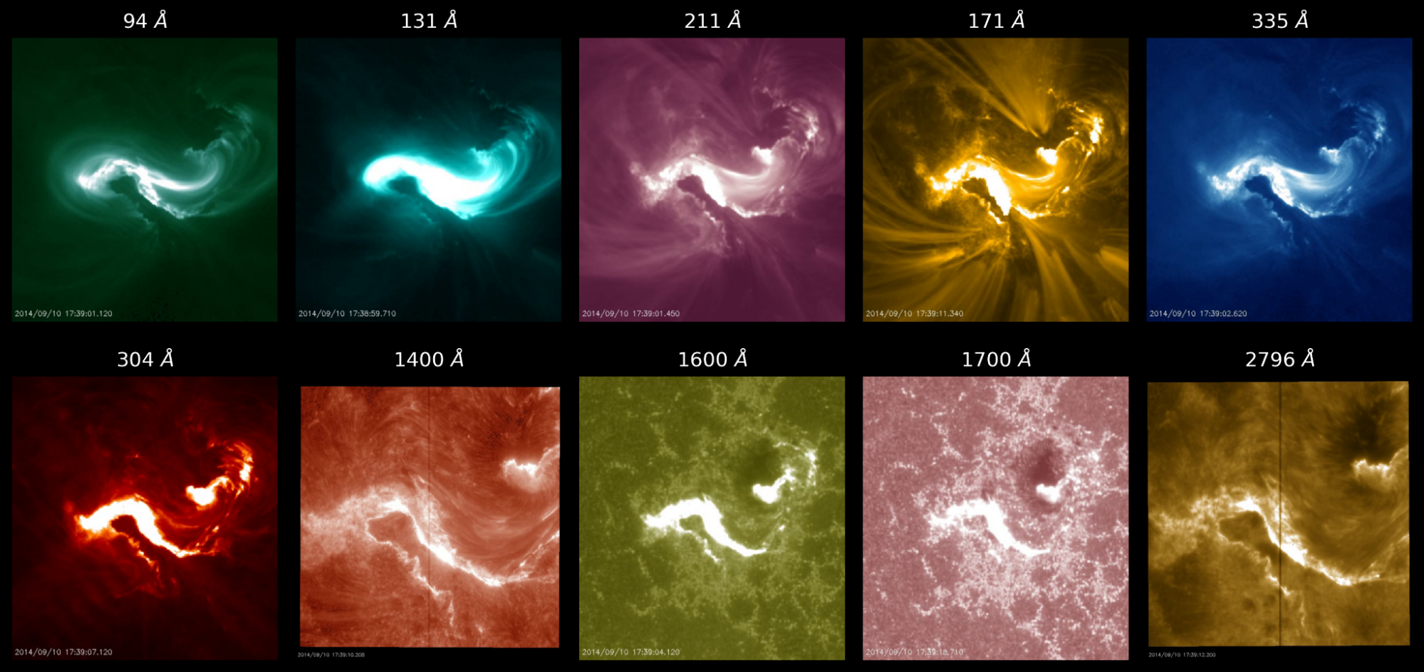
Fig. 1: A solar flare as seen in different wavelengths (listed on top of each panel). Shorter wavelengths mean more energy. From 94 Å to 2796 Å, as temperature reduces, different structures in the solar atmosphere are clearly seen, from S shaped loops to longer loops to finally a dark sunspot-like patch from 1600 Å onwards! Images assembled from AIA data (corona) and Slit-Jaw Imager (chromosphere).
This is just one aspect of the light that comes to us. The other aspect is that the material which emits this light, also leaves an imprint on “how bright” the light is at different wavelengths. This is slightly different from the Thermal radiation, which depends only on the temperature. The typical brightness at every wavelength for light coming due to an object being hot, looks somewhat like the top row in Fig. 2. Here, notice that the brightness shows some variation with wavelength (which, I remind you, is given by the colour of light) - but the essential point is that every wavelength has some amount of brightness.
Now, check out the second row - corresponding to a Sodium atom. You will see that the brightness is present at discrete locations in wavelength, and most of the wavelengths have no brightness. This is in stark contrast to the thermal radiation, and is followed similarly by all other elements listed in the rows below Sodium. But note that the pattern, or location & brightness of these spectral lines of different elements is unique for each element. In a sense, spectral lines can be thought of as a fingerprint of atoms and molecules. Just like each human has a unique set of fingerprints, similarly each atom or molecule has a specific set of spectral lines as its signature. These lines you see are bright in specific wavelengths, and are called emission lines.
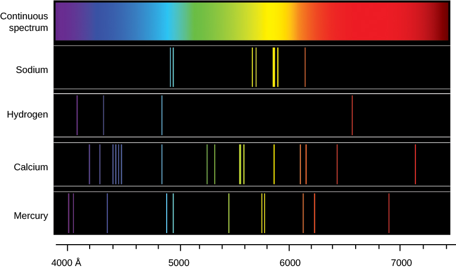
Fig. 2: Examples of many spectrum (=spectra). On the bottom most axis, the wavelength increases from 4000 Å (left) to more than 7000 Å (right). The top row shows what is called a continuous spectrum, which depends only on the temperature of the object. Each subsequent row shows how much bright light is in each wavelength, for different atoms listed to the left. Image source: OpenStax .
Astronomers study the spectral lines of different objects like stars, galaxies, etc, and try to figure out which all atoms, ions and molecules are present in the object of study. Remember, what I have shown in Fig. 2 is the light coming from one vertical slit - that is why, the spectral lines are all seen as vertical lines. But this need not be the case - I can also look at approximately one point on the Sun (or even average over the vertical line), for example, and get its spectrum out. This exercise will give us a result similar to Fig. 3, where we just have the brightness of light for every wavelength. This is the kind of spectrum astronomers generally analyze.

Fig. 3: The intensity of various spectral lines as a function of wavelength. Taken from CHIANTI.
A side note here: The spectrum shown Fig. 3 is the brightness (or rather the intensity) for every wavelength. We can then construct a similar spectrum for a large region of the Sun, and obtain such spectra for each point. Now, if we consider the intensity at, let’s say 2796 Å for each point, we will get an image similar to the last panel in Fig. 1. How cool is that!4
You will now have many questions: why is the spectrum of individual elements only at specific wavelengths, and not everywhere? What conditions give rise to the brightness of these lines? First off, you find the spectrum of elements at discrete wavelength locations because these arise from atomic transitions between two approximately fixed energy levels. The quantum of Quantum mechanics gives rise to this discrete nature5. Next, the spectrum itself depends on, among other parameters, 4 critical properties: the temperature of the region where the spectrum is generated, density of the material giving rise to the spectrum, velocity of this material, and turbulence6. These properties, under certain circumstances, can be easily inferred from just the spectrum of an atom.
First off, note that the material which emits this light is a fluid (more precisely, plasma) in our case. Hence, the temperature and density of the plasma determine if a given spectral line will even form. So just knowing the fact that a given line is seen tells us the possible range of values temperature and quantity can take. Next, the brightness of the line is in most cases dominated by the density of plasma – more density, more brightness, but you do have the effect of atomic physics and temperature. Third, the wavelength where we expect the line brightness to peak can be shifted to different wavelengths too! This is called Doppler shift. If the plasma is moving towards us, the shift is toward shorter wavelengths (called Blueshift), and if the plasma is moving away from us, the shift is toward longer wavelengths (called Redshifts)7. Finally, if you see in Fig. 3, the line does not immediately peak at one wavelength. Rather, it starts to increase from one wavelength, reaches a maximum, and then reduces. This is called the line width, and is determined by the temperature, and turbulence in the plasma. Turbulence basically is a measure of how much fluctuation of different spatial sizes is present in the fluid - it is yet another measure of what the plasma we consider is like.
So TLDR in summary, using spectral lines, we can get an estimate of local temperature, velocity, density and turbulence of these plasma parcels through spectral lines. So what is the big idea?
The big idea is that some specific regions on the Sun are thought to give rise to a stream of particles called the solar wind. We know that these regions are important, but we don’t know at what height the solar wind starts to form. Now, the solar wind is basically a stream of particles coming out of the Sun. So if you are looking “down” on the Sun, you will see that the particles are coming towards you. This means the spectral line which the particles emit will be blueshifted. So the basic idea is that we study these Doppler shifts for plasma which correspond to different wavelengths (and so different heights and temperatures, like Fig. 1), and see where the blueshifts start!
Now, these regions, which are thought to give rise to the solar wind, are called Coronal holes (CHs) - because they are seen as dark patches in the solar corona. In Fig. 4b below, all dark regions belong to CHs, while the brighter regions belong to Quiet Sun8 (QS). These regions appear very different in the solar corona. However, if we check what these regions look like at lower heights called the chromosphere, the differences are reduced (see Fig. 4a)! Why so? Has this “vanishing” of difference got anything to do with the solar wind? Can we do specific studies of these regions, and figure out what causes these differences? Are they dependent on the underlying magnetic field in any way? This was our primary objective of study.
At this juncture, I should tell you that scientists have done extensive studies of the CHs and QS regions in the corona, and all of the information I have presented in the last two or so paragraphs was generated in the last three decades. So we do stand on the shoulders of other giants – while we do bring our own thought process to the table!
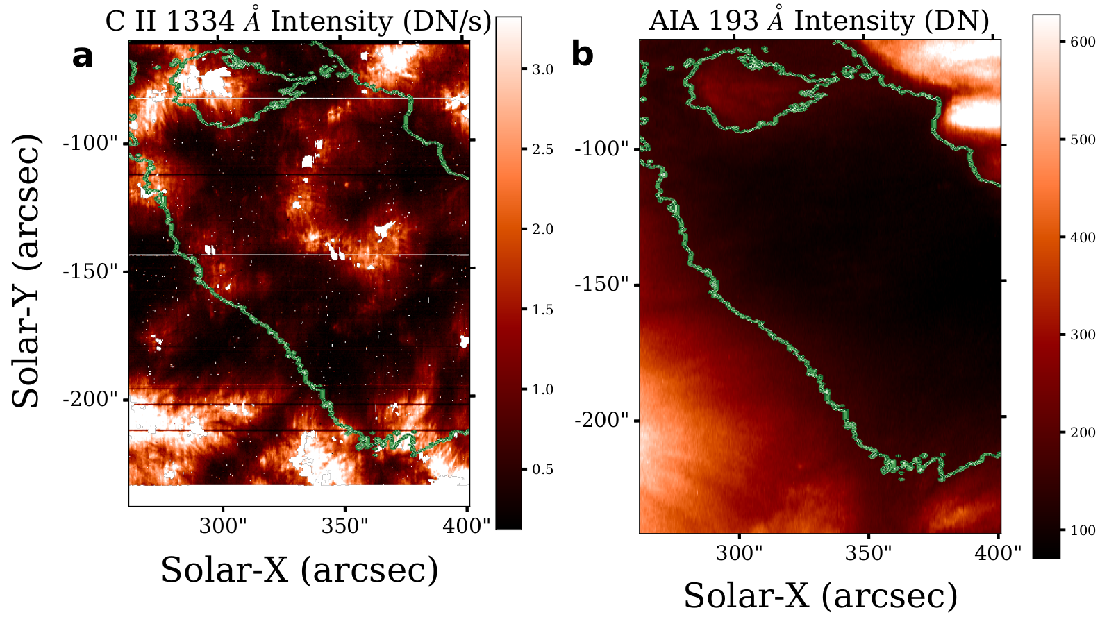
Fig. 4: An image of the CHs and surrounding QS region in the upper chromosphere (left panel) and the corona (right panel). The green lines demarcate CHs from QS in both the figures. Image source: Vishal.U et al., 2021 .
Back to our work: we studied one spectral line (yep, just one line, and you will see how much information we can infer from it!), and its properties across both the CHs and QS regions. This line forms due to a transition of the C+ ion (called CII by astrophysicists) at a wavelength of 1334 Å. How do we know the correct wavelength? We can perform controlled experiments in labs on Earth and figure it out. Now, you have already seen how there is not a great difference between CH and QS in the intensity image of Fig. 4a. Similar results hold if we look at what the plasma velocity and line width are in Fig. 5. This tells us that if I were to not tell you where the CH and QS regions are, you cannot figure them out from either the intensity, velocity, or the width of the C II line. Thus, on a gross scale, the CH and QS are very similar!
Interesting things happen if we account for the underlying magnetic field. How do we do this? We ask: what is the intensity in CH and QS at similar magnetic field strengths? Similarly, what are the velocities and line widths? The underlying magnetic field strength9 might be similar, but the structure of the magnetic field can be different! The structure of magnetic field (a.k.a magnetic topology) is important, because we know that the CHs are regions where the magnetic field comes out predominantly in open lines10, while in QS the same magnetic field comes as short closed loops. These differences are seen clearly in the corona – but are they also seen in the chromosphere?
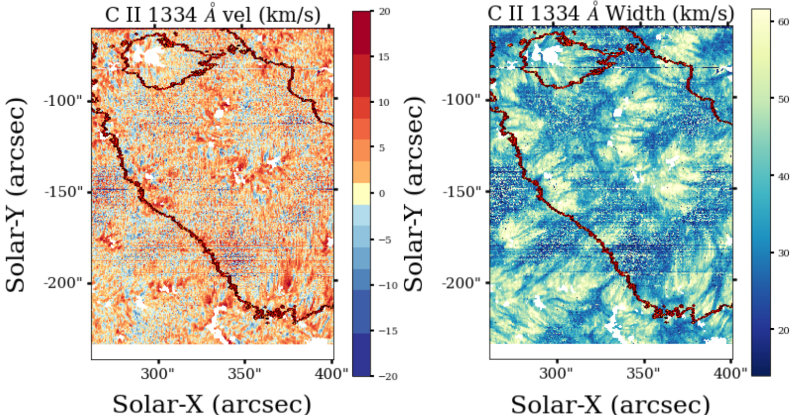
Fig. 5: Velocity (left) and line width (right) of the C II line in CH and QS. The positive velocity is called “redshift” and tells how fast plasma is moving away from us, while the negative velocity is called “blueshift”, and tells how fast plasma is moving towards us. The larger line width means the line is broader, indicating larger turbulence effects and some non trivial effects. Image source: Vishal.U et al., 2021.
Turns out it is the case! We can indeed differentiate between CH and QS if we consider regions with similar magnetic field strength. In Fig. 6, the black dots correspond to the average of quantity in Y-axis (Intensity, velocity, width) for regions with similar magnetic field strength (in X-axis). On an average, you see that the QS intensity is larger than the CH intensity in Fig. 6a – reminiscent of the differences in the corona, and seen statistically here. So one question is answered: CHs and QS are already differentiated in the chromosphere, but you can see this only statistically!11
Next, look at panel (b) of the same figure. The velocity is mostly positive - indicating plasma moving away from us, and down towards the photosphere. Thus, the chromosphere is, on average, flowing downwards into the Sun. However, it is interesting to see that at 40 Gauss, a switchover occurs: for less field strength, the QS has plasma flowing down faster, while it is CH for larger field strength. This is counter intuitive – if the solar wind comes out and towards us in the CH, why is plasma moving away from us in CH?
Finally, see panel (c) of the same figure. The line width is seen to increase with field strength. This tells us that the profiles are getting broader, possibly implying larger turbulence with increasing field strength. Here too, CHs are broader than QS for large field strengths!
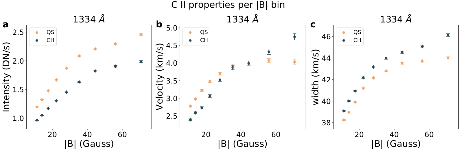
Fig. 6: Different properties of CH (black) and QS (orange) as a function of magnetic field strength (|B|). Image source: Vishal.U et al., 2021.
Things don’t stop here. The velocity panel in Fig. 6b raises many questions. And so, we repeat the analysis with a tweak - this time, we consider the blueshifts and redshifts separately. Why so? This is important to understand if the field strength has preferentially some effect on the blueshifts and redshifts, which get averaged out in Fig. 6b. And so, we check what the speeds look like in Fig.7.
In panel (a) of Fig. 7, the CHs have larger blueshifts over QS, telling us plasma is indeed preferentially moving towards us in the CHs. Thus, in principle, these blueshifts could be a signature of the solar wind. Now we are in business!
In panel (b), we check what the downflows look like. It seems for regions with large field strength, plasma is flowing into the Sun faster in CHs over QS. This was the signature which confused us in Fig. 6b. Why does the CH, which is understood to be a source of particles coming out towards the Earth, have particles going into the Sun, and away from the Earth preferentially? Are we doing something wrong? Or are the spectral profiles, and thus the process which generates these lines different in CHs and QS?
Turns out it is not the case. I will not show the plot here (already there is an overdose of information – too much of a good thing is also not good! :P), but we find that the spectral profiles are very similar in both CH and QS. Thus, it tells us that the processes which give rise to these profiles are similar in both the regions – the differences are coming out only because of the differences in the magnetic field topology of CHs and QS!
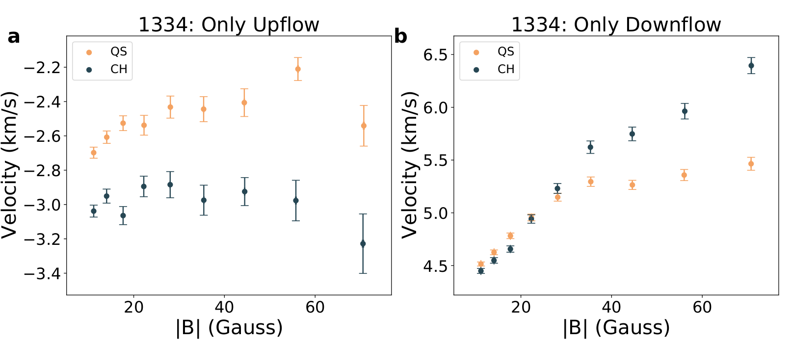
Fig. 7: The velocity variation with magnetic field strength, for regions with only upflows (left) and only downflows (right) for CHs (black) and QS (orange). Image source: Vishal.U et al., 2021 .
Thus, through this work, we find that the CHs and QS might appear similar overall, but the differentiation in chromosphere is seen clearly if we consider regions with similar magnetic field strength. This differentiation is seen clearly as less intensity and excess line width in CHs over QS. The differentiation is clearly seen to arise primarily due to the magnetic field topology, and not due to fundamental differences in the way these lines form. However, our work poses a bunch of fundamental questions: Why is plasma flowing faster away from us in CHs over QS, when these CHs are supposed to be the sources of solar wind? Does this “redshift” bear any relation to the solar wind? How do these results tie up with analysis done for lines which form at higher temperatures (and hence, in the transition region & corona), and lower temperatures (lower & mid chromosphere)? And do the blueshifts we find in Fig. 7b have any relation with the solar wind?
To know more, and understand what happens next, keep watching this space!
Original paper: Properties of the C II 1334 Å line in Coronal Hole and Quiet Sun as observed by IRIS
First Author: Vishal Upendran
Co-authors: Durgesh Tripathi
First author’s Institution: Inter University Centre for Astronomy and Astrophysics, Pune, 411007, India
-
But don’t worry too much. The amount of X-rays given in hospitals do not cause any harm! ↩
-
This is an exercise for you - go look up why we see the Sun more yellow than green! ↩
-
To know more on why this is the case, refer to my other article on the coronal heating problem! ↩
-
As we will see later, plasma flowing up or down will change this location! ↩
-
Technically I should call it “non-thermal effect”, and it may result due to various reasons. Turbulence is supposedly one of the reasons giving rise to this effect. ↩
-
Checkout this cool link for more info on Doppler shifts ↩
-
I have talked in detail on the Coronal holes in the solar wind article, and on Quiet Sun in the nanoflare heating article. ↩
-
Magnetic field strength = Bx2+By2+Bz2. The individual B can be different, while the sum squared remains the same! ↩
-
When I say open, I mean that these field lines close at distances far larger than the size of our CH, on the Sun. Remember, we cannot have truly open fields since magnetic monopoles do not exist! ↩
-
Note that this question was also answered by Pradeep Kayshap et al 2018 for the Mg II line, which also forms in the chromosphere. ↩